University Website: Workshop Techniques
For today’s educational institutions, the website plays a vital role in the organization’s mission. It enhances educational activities, supports communication with academic peers, professional colleagues, political decision makers, clients, students, parents and citizens, contributes to the marketing efforts, and fosters accountability and collaboration by enhancing transparency.
The question of how to choose appropriate features and structural patterns for the website can be characterized as a ‘wicked problem’ with no true or false answers. Instead, many parties are equally equipped, interested or entitled to judge the solution. Judgments are likely to differ widely based on personal or group interests and values. Once implemented, any solution will generate waves of consequences over an extended period of time that are difficult to pinpoint and evaluate.
Information design for university websites is a particularly challenging task in terms of process and product. The design process needs to take into account the complex organizational affordances for decision making in an academic environment. The design product needs to measure up to the wide variety of genres, contexts and voices. Typically, the web design challenges are less technological in nature as they are connected to the social aspects of information technology, e.g., the organizations ability to negotiate an overarching shared vision and structure as well as flexibility for each individual’s specific emphasis. This design challenge necessitates focusing on the users’ perspective.
The Carolina MPA program is currently in the process of re-imagining its website. I had the pleasure to facilitate different workshop activities as an instructional designer for the website’s stakeholders and decision-makers.

Red card, green card: Quick, effective feedback
An initial step was to analyze the current features of the website. Here, we used a simple ‘red card, green card’ exercise to gather opinions about what to keep and what to change. This lead to a shared understanding among the participants of the goals in redesigning the website.
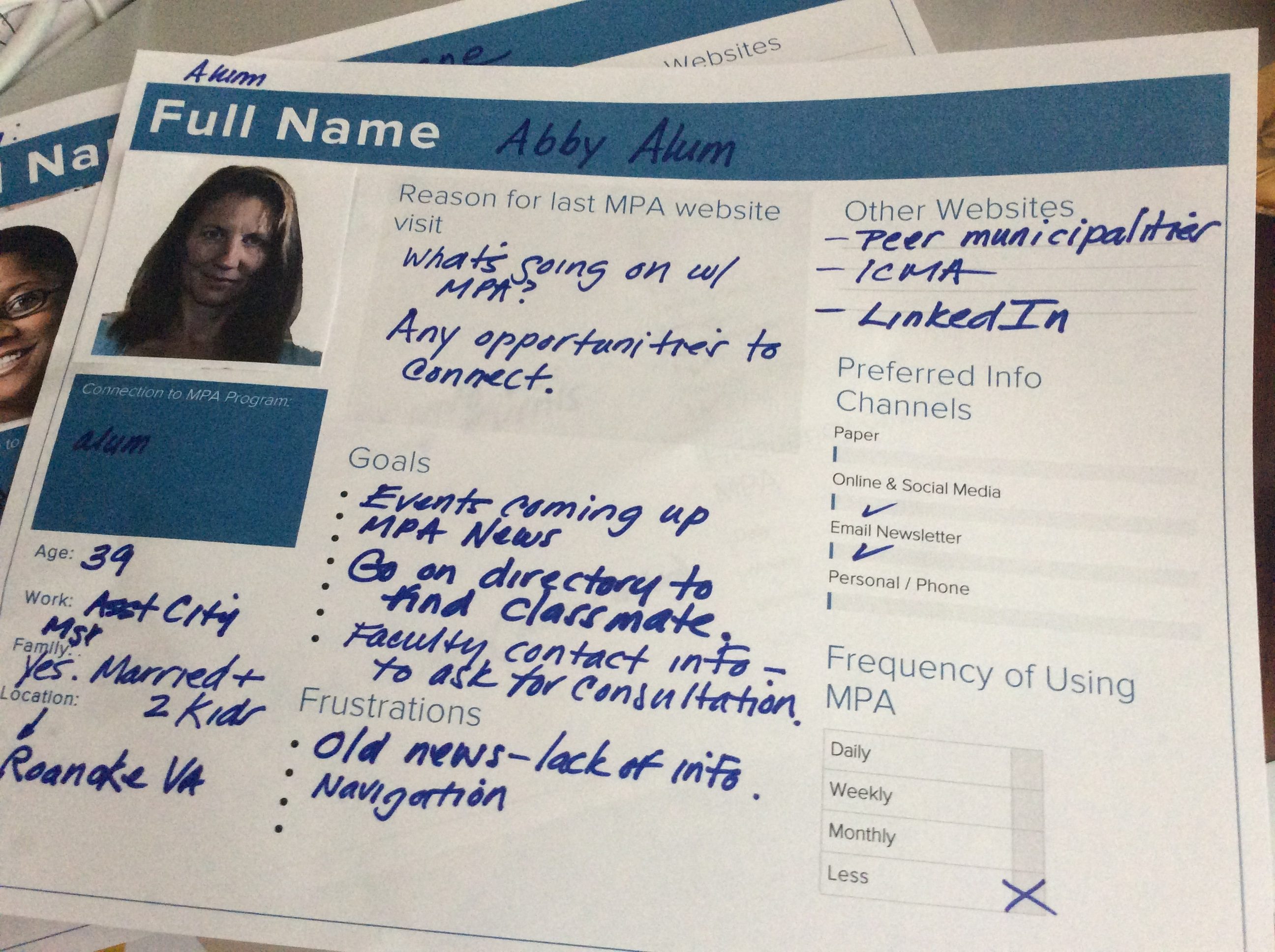
Personas shift attention from personal preferences to the website’s audience
We followed this by a personas activity. Understanding the diversity in audience, the motives for visiting the website, the user’s various needs, idiosyncrasies, preferences, concepts and backgrounds is one of the core challenges in design. During the workshop, small groups of 2-3 people created personas (fictional user profiles) to represent core audiences. I used the personas template by Xtensio which worked very well for both preparation and documentation.
Lastly, we focused on website structure – the navigation, menu and homepage. To facilitate the discussion, I used a creative method inspired by LEGO Serious Play. We worked in two teams. One group focused on the homepage structure; another group worked on the main navigation menus. Lego plates were used to structure different segments – the main website areas (menu) or the above the fold, below the fold sections of the homepage. Lego bricks, annotated with play-dough and notecards, represented content.
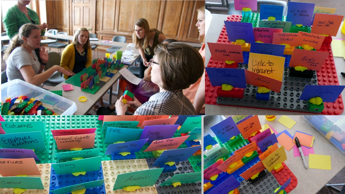
Inspired by LEGO serious play – building the information architecture with bricks.
Further Information
Panke, Stefanie, Georgia Allen, and Dan McAvinchey. “Re-Envisioning the University Website: Participatory Design Case Study.” E-Learn: World Conference on E-Learning in Corporate, Government, Healthcare, and Higher Education. Vol. 2014. No. 1. 2014.
Frick, Elisabetta, Stefano Tardini, and Lorenzo Cantoni.(2013). “LEGO® SERIOUS PLAY®.” Università della Svizzera italiana, Lugano, Switzerland
Lego Serious Play
