A Peek into Text Mining (II): Data Visualization
Many educational technology researchers leverage social media data to answer questions about trends, collaboration or learning networks. If you are not a programmer, you will most likely use existing apps and tools to conduct quantitative data analysis and generate visualizations such as word clouds and clusters. As more and more educators are acknowledging coding as an important digital literacy, this post we will explore some common techniques of statistical data visualization.
In my last posting on text mining, I described how to collect data from Twitter. In this post, I will describe how we can summarize a large set of tweets on a certain topic – for example the latest SITE conference.
Background: Giving structure to your data
Text data, such as tweets, comments or posts usually comes with limited structure, as compared to scores on likert scales. To visualize and quantify the data we have to give it structure in the first place. Suppose we have a character vector as the following:
 > texts

[1] "I am a member of the XYZ association"

[2] "Please apply for our open position"

[3] "The XYZ memorial lecture takes place on wednesday"

[4] "Vote for the most popular lecturer!"
What is a character vector? You can think of a character vector as a container of all text pieces. Each piece represents the text from an individual, and is assigned a number. You can access any piece by using its given number. This type of data is easy for humans to read, but not for machines. Machine prefers the same information structured in the following way:
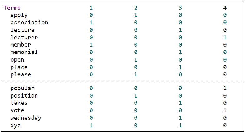
A text file structured in this way is called document-term matrix. Each row in the matrix represents a word, while each column represents a document, which refers to all the texts from an individual. Each element in the matrix represents the number of times a particular word appears in a particular document. You may have noticed that all texts have been converted to lowercase in this matrix, while some words, like “a” or “the” are not shown up in the matrix.
To convert the tweet texts you collect into a document-term matrix, the following steps are usually necessary:
- Remove nonsense characters
- Convert all words to lowercase.
- Remove stop words, such as “a”, “an”, “that” and “the”.
As you can see, by delineating the text into single words, its meaning may change significantly. This is why it oftentimes makes sense to combine qualitative and quantitative approaches when analyzing data sets – simply looking at a word cloud is not a replacement for meaningful analysis of qualitative text data.
Sample Data – Tweets on #siteconf
Did you miss your favorite AACE conference? Would you like to find out what predominant topics people discussed? We collected 709 tweets using the hashtags “#siteconf”.
Step 1: Word Clouds
To take a quick look at our data, an initial visual representation with world clouds is helpful.
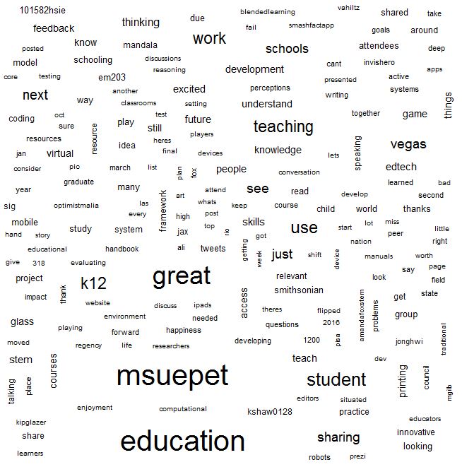 As you can see, the word clouds present us some key information as well as a lot of noise. We can spot some popular topics at a glance, but it is impossible to see how concepts are related.
Step 2: Cluster Tree
A more structured way to explore the data in an associational sense is to look at the collection of terms that frequently co-occur. This method is called cluster analysis.
Cluster analysis is a way of finding association between items and bind nearby items into groups. A typical visualization technique is a tree diagram called dendrogram. The most common cluster analysis include K-means clustering and hierarchical clustering. K-means clustering require you to specify how many groups you prefer to have in the result before the analysis, while hierarchical clustering doesn’t have this requirement.
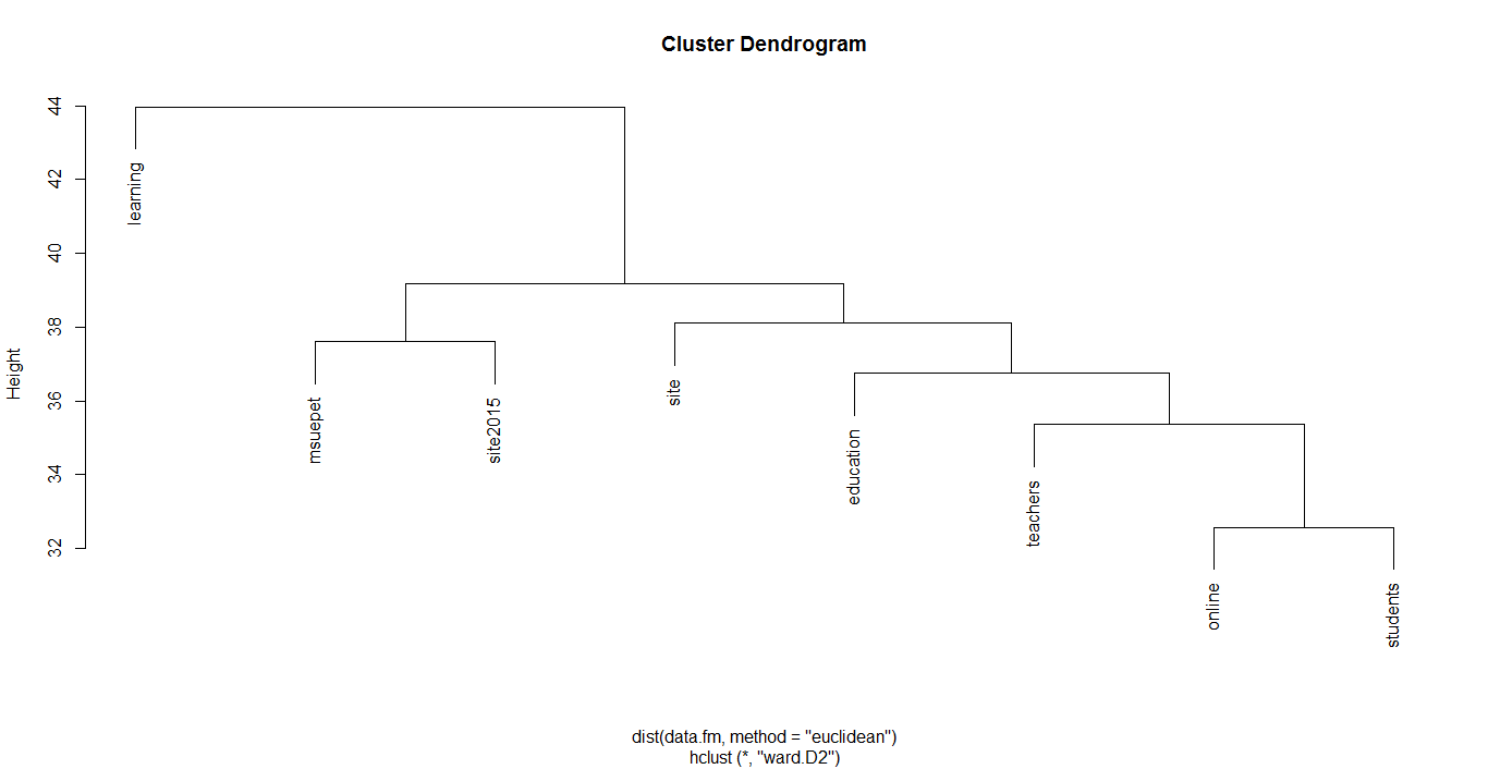
The density and shape of the dendrogram may vary depending on the sparsity. The above one is the dendrogram on sparsity .95. It is interesting that when people tweeted using the hashtag “#msueped”, they also tended to use “#site2015”. “#msueped” stands for Educational Psychology and Educational Technology from Michigan State University. You can tell that many people from this program went to SITE 2015 conference.
Conclusion
Did you gain a sense what the SITE community is talking about? Data visualization is certainly helpful to make sense of large datasets as it allows you to gain an overview from an elevated perspective. However, don’t mistake a set of images for the real thing. If you attended SITE 2015 in Las Vegas, your first hand experience is likely to be totally different and certainly more in-depth. Also keep in mind that while social media is becoming ever more popular, Twitter users are still only a sub-group of the whole audience.
No approach is neutral in its analysis: Understanding the tools that we use helps us to interpret seemingly obvious connections more carefully. If you want to explore how we produced these visualizations use our sample data set with instructions.
