How Informational are Infographics? An Interview with Julia Moritz
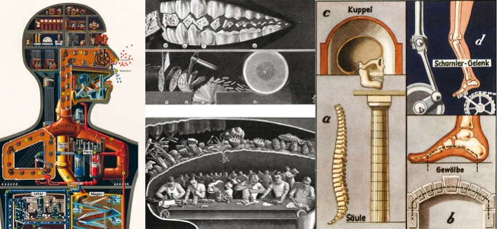
Collage of Inforgraphics by Fritz Kahn (1926, © Kosmos Verlag; 1931, © Axel Springer AG Berlin, Corporate archives; © 1939, © Fritz Kahn). For a curated gallery of images, art book and historical research contact the siblings Uta von Debschitz and Thilo von Debschitz at [email protected]
Infographics visualize topics and data in a compact format, and are of growing importance for learning material and editorial media. The carefully crafted design of icons, arrows, symbols and numbers is visually appealing. Cloud applications such as vis.me, Piktochart or ease.ly offer effective authoring tools.
How do infographics support readers and learners in extracting the relevant information? Julia Moritz researched this question in her PhD thesis. Specifically, she looked at the effect of interactivity in infographics. Do users leverage the opportunity to strategically reorganize information? Does the interactivity support active processing and deepen understanding?
Julia works at the ‘Leibniz-Institut für Wissensmedien’ (IWM), a German Leibniz Research institute that focuses on the effects of digital media such as web environments, educational technology and social media on acquiring, applying and exchanging knowledge. In the interview we talk about Julia’s research, her own interest in the topic and the work of the ‘Realistic Depictions’ Lab at Germany’s premiere research institute for knowledge media.
What is your academic background and how did you end up working at an institute that focuses on knowledge media?
I studied psychology with a focus on industrial and organizational psychology and media and educational psychology in Tübingen, Germany. Contrary to what most people think, psychologists not only deal with mental disorders and their treatment, but also with the “normal” behavior of people. This also includes learning or dealing with information.
During my studies I have been interested in human-machine interaction in different contexts and have worked as a student assistant at the IWM. I liked the idea of using the possibilities of digital technologies to facilitate cognitive processes such as meaning making and knowledge acquisition.
You are part of the research team ‘Realistic Depictions’. What is the main focus of your group within the larger Institute?
The ‘Realistic Depictions’ Lab focuses on the processes underlying information processing and knowledge acquisition when looking at vivid static and dynamic representations, such as touchable models, videos or virtual environments. These realistic representations have a high degree of similarity to real situations and events, but also differ systematically in some points. In the working group, we deal with the individual learners’ knowledge-related processes when using (digital) information with a specific focus on the similarity between representation and reality. We deal, for example, with the question of the conditions under which a high degree of realism is conducive to the acquisition of knowledge. Our studies can be applied in fields of informal learning such as museums and exhibitions. Other labs at the institute focus on different aspects of knowledge-related processes of individuals or groups and how these processes are influenced by digital media. Research questions include, for instance: How do learners process combinations of text and pictures? Or how do people construct new knowledge together on digital platforms?
When did you first develop an interest in infographics and what do you find fascinating about them?
I have been always interested in visual communication and aesthetics. When I finished my studies, I had the opportunity to work in a project that dealt with user-generated maps. From user-generated thematic maps to cartographic infographics, the path was only a small one.
I like the incredible heterogeneity of infographics. As different as the topics they depict can be, so different can the infographics themselves be designed.
Are infographics a new phenomenon, or have they been around for a long time?
Infographics have become significantly more present in the media in recent years. They are particularly suitable for presenting large amounts of data in an understandable way and making them accessible to a broad public. They often follow a particular narrative and are visually appealing. This gives them a certain entertainment value, which makes them popular. Nevertheless, infographics are nothing new. Their history spans several centuries. Even Leonardo DaVinci’s drawing of the ideal human proportions can be interpreted as infographics, as can some medieval maps and illustrations from medical books.
Do you have a favorite infographic?
I don’t have any special infographic that I particularly like. Rather, I admire the representation of the structures and functions of the human body that Fritz Kahn used for his books. He was a German doctor in the first half of the 20th century and was responsible for numerous books about the human body. His idea to illustrate human organs as if they were machines and thus to emphasize the important processes is brilliant.
Have other researchers investigated infographics? How is your own research connected to the field?
The term infographic or information graphic is used in different fields of research, for instance in media technology, communication science or psychology. All of these disciplines have their own focus ranging from the technical aspects of programming and designing infographics, their use and acceptance to the effects that infographics have on understanding and knowledge. My own research is mainly connected to the research that deals with psychological aspects of interactive visualizations or multimedia. I integrate findings from this field into my research on infographics.
What are the main findings of your thesis?
When visualizing information, there is always a trade-off between addressing a wide range of possible tasks and providing a visualization that is as simple as possible for the actual task.
In our studies, we could show that interactive functions that provide the option to adapt infographics to the individual requirements might be a solution to this conflict.
However, the beneficial effect of representation control was limited in various regards. First, representation control only facilitated the actual performance when the task required answering a specific question (i.e., when a certain goal was given), but not when goal-free tasks were worked on (e.g. read off as much information as possible). Second, representation control did not benefit the learning of the task structure in preparation of future tasks that did not provide representation control. When participants were confronted with the same or similar tasks without the option to control the representation, their performance dropped.
What implications does your research have for instructional designers?
From a practical point of view, it is important to differentiate between task performance and learning. Especially in educational contexts, most tasks are not only designed to communicate information to students but also to enable students for the future to master similar tasks by their own. With the results of my research, I could demonstrate that practicing an information extraction task with interactive infographics is only beneficial if in subsequent tasks the infographics also allow the use of these interactive functions. If this was not the case, performance in subsequent tasks was not improved, i.e. practicing with interactive features did not lead to learning of the task structure. Thus, instructional designers should keep this distinction between the actual task performance and the sustainable procedural learning in mind when they decide whether to offer interactive features in infographics or not.
What’s next for you now that you have completed your PhD?
Currently, I am working in a project that deals with the development of an online portal in which the distribution data of birds can be visualized in maps by citizen scientists themselves. In this project, we address two main questions. How can we support the map users´understanding that the database is not equally reliable in all regions? And how does a more detailed and personalized visualization influence the motivation to contribute data to the database? That means, at the moment, the cartographic aspect of visualizations is more in the center of my research.
